Plastic Cycle
Educate and excite the experience of recycling

Timeline
6 weeks - January - March 2021

Tools
Figma,

Roles
UI/UX, Visual Design, User Research, Prototyping
Project Overview

Plastic Cycle is an environmental equity app aiming to help users become more eco-friendly through recycling. The app tries to combat the overconsumption of single-use plastic and offers plastic-free alternatives to their daily items. Encourages users to recycle by aiding their process such as telling them which colored bin an item goes in. There are also challenges that users can take on to encourage them to adopt more eco-friendly habits.

Understanding the problem space

Research

I started by brainstorming and coming up with a variety of equity issues, and after coming up with many issues, I narrowed down a specific problem. From there I researched the topic of recycling and began to uncover problems.

Research findings

Here are some of my findings
- Recycling is an accessible form of being more sustainable as 74% of Americans have access to curbside recycling.
- Despite this, the national average recycling rate is only 37.4%.
-The current numbering system that people refer to for items that are recyclable or not, is easily misunderstood.

The problem

Americans produce roughly 258 million tons of waste a year. With roughly 74% of the waste being recyclable but most of it gets thrown in landfills or pollutes the water. Recycling can help decrease a bit of the waste that is produced yearly.

With the problem in mind, how might we encourage people to become more eco-friendly and adopt better recycling habits?

Goals

To address the problem, providing an easy way for users to distinguish between recyclable items and those that can’t be recycled would be a nice way to ease the user into the app. Providing information on which colored bin and item go in such as the blue recycle bin or the black landfill bin. All of this is to provide educational information but it won’t guilt trip or peer pressure the user, rather it’s used to inform the user.

Competitive analysis

I looked at a few apps such as olio, irecycle, mywaste, and mylittleplasticfootprint.

Apps like irecycle has a feature that tells users where is the nearest recycling center.

Mylittleplasticfootprint have quizzes that tell the user how much of an effect each item created in waste and also track the user’s personal plastic mass index (how much plastic pollution a user contributes to yearly).

Affinity Mapping

Brainstorming potential solutions and through the help of my classmates, we collectively voted on features that would be most functional to have within the app. These gave me ideas for further iterations that I created and helped me get a better understanding of what are users may want or expect from the app

User flow

After competitive analysis, user personas, and affinity mapping, I proceeded to create a user flow. I tried to incorporate items that users may want but also make sure that it can stand against other existing apps. With everything in mind I started the first iteration (paper prototype)

Ideation + Visual Design

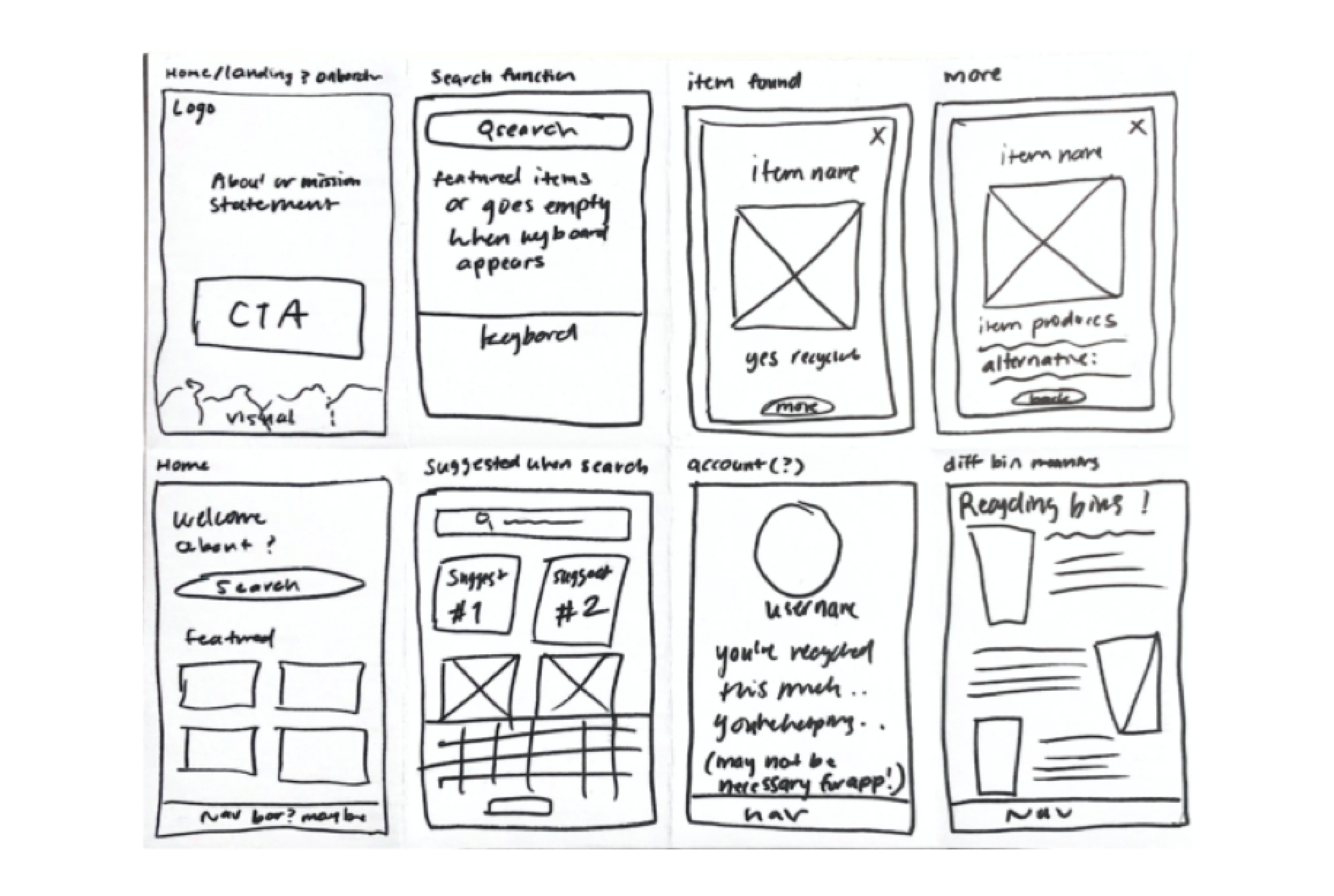
Sketches

Landing page -> search bar -> search for an item -> read about item -> read about plastic free alternative

Mid-Fi Wireframes

I was able to user test the low-fi wireframes and the feedback that I received was that the process is straightforward and easy to understand. So, I moved forward with a mid-fidelity prototype and I kept in mind points from previous research and tried to address the reasons why someone is deterred from recycling such as not knowing the recycling process such as the different colored garbage bins.

User testing

- Testers noted that the navigation icons weren’t clear and had a hard time navigating the app.
- One tester noted, “the hamburger icon is confusing, I’m not sure what to do here.”
- Certain areas such as the cards, the type seemed small and hard to read so it was hard to navigate.
- The list part was confusing to users, they didn’t know how to navigate it
- Some wishes that there was a scan function rather than having to type all the items to find them
- One tester mentioned how it would be nice to have an incentive for the app
- Onboarding was also confusing, it brought the user straight to the search without much information on what the app was about

Navigation Bar Iterations

Based on user testing I adjusted the features accordingly

Final Solution and Onboarding